Disciplines
Brand Identity
Industries
Challenge
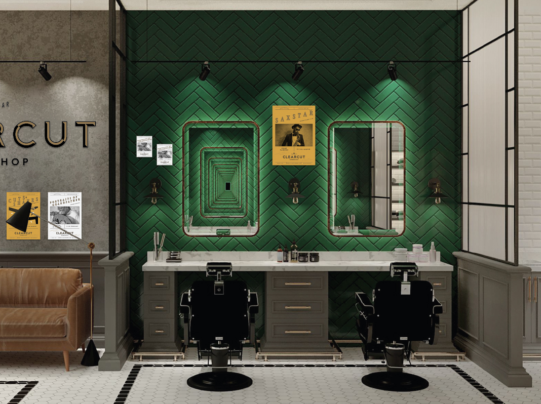
Enjoying the grooming experience was a priority for Clearcut, a new barber shop located in Qatar. Clearcut is a barber shop with personality, a place where you can socialise while getting groomed. A place that has a real sense of community in a new neighborhood.
Tradition was also key to Clearcut, and they challenged us to create a brand that could combine a retro barber shop feel, while having a modern appeal, with their ethos of community spirit.
Solution
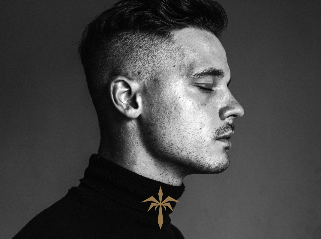
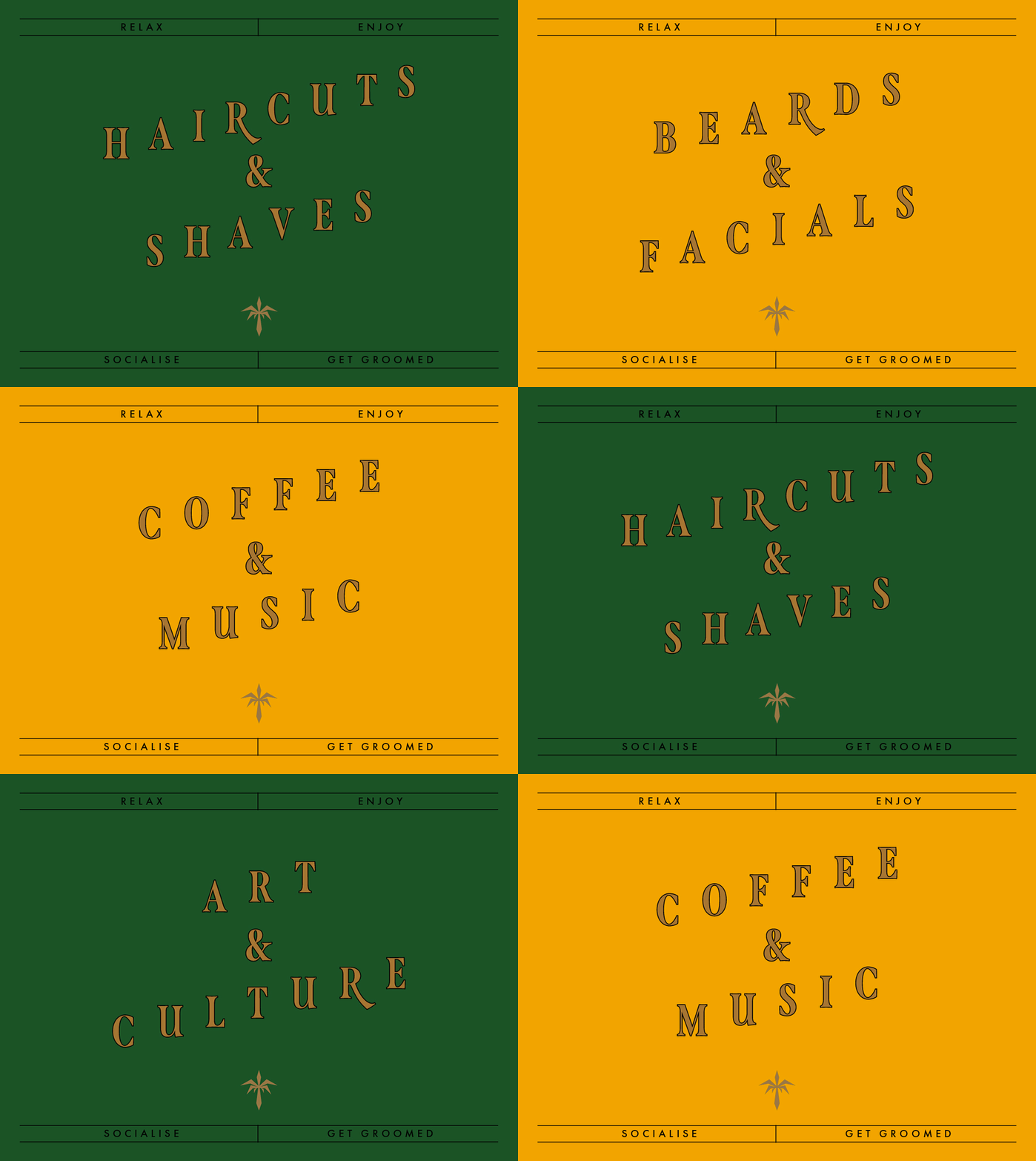
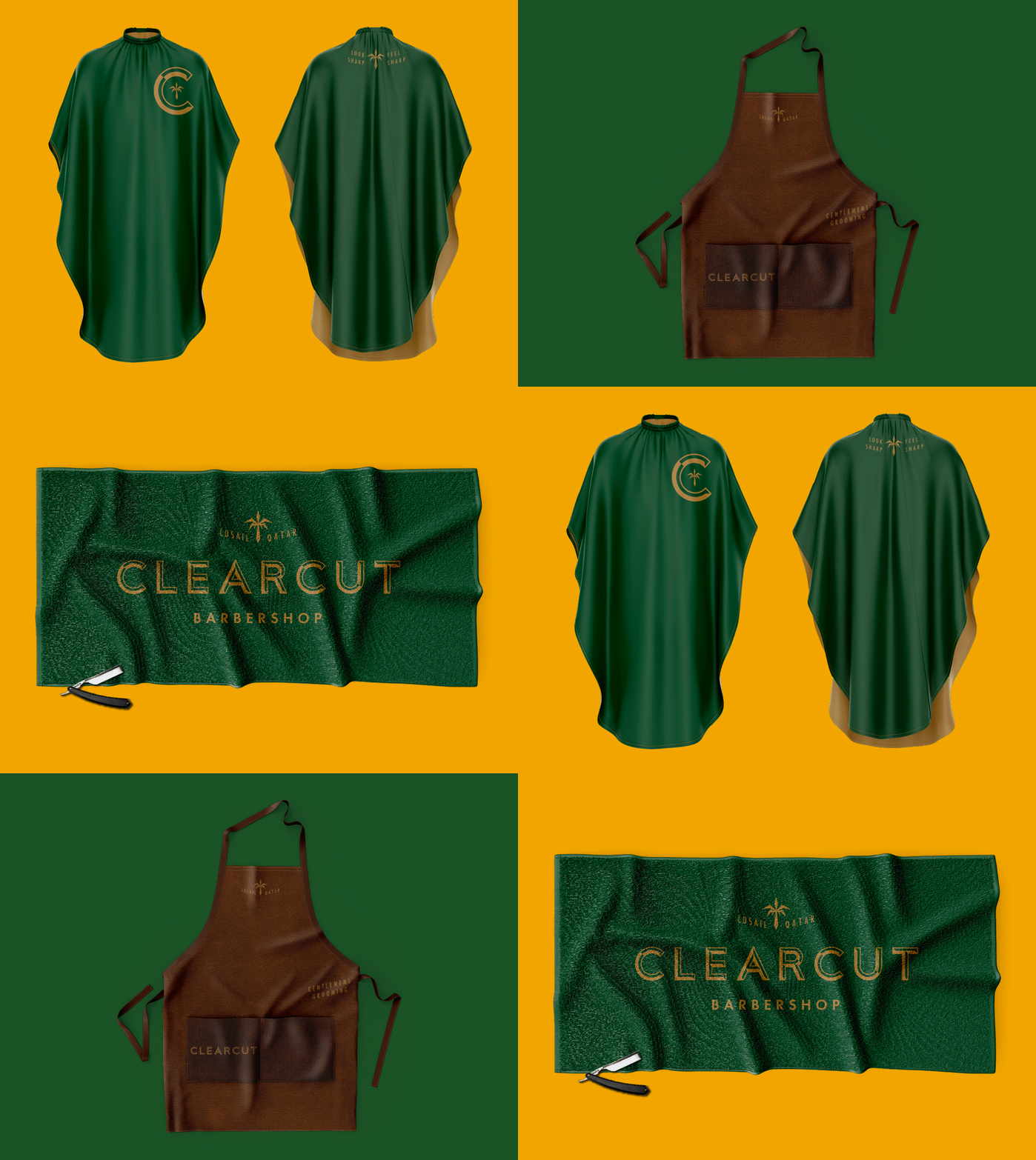
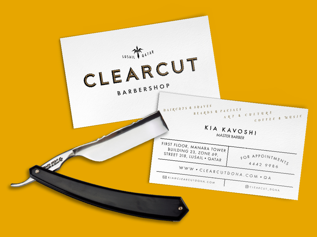
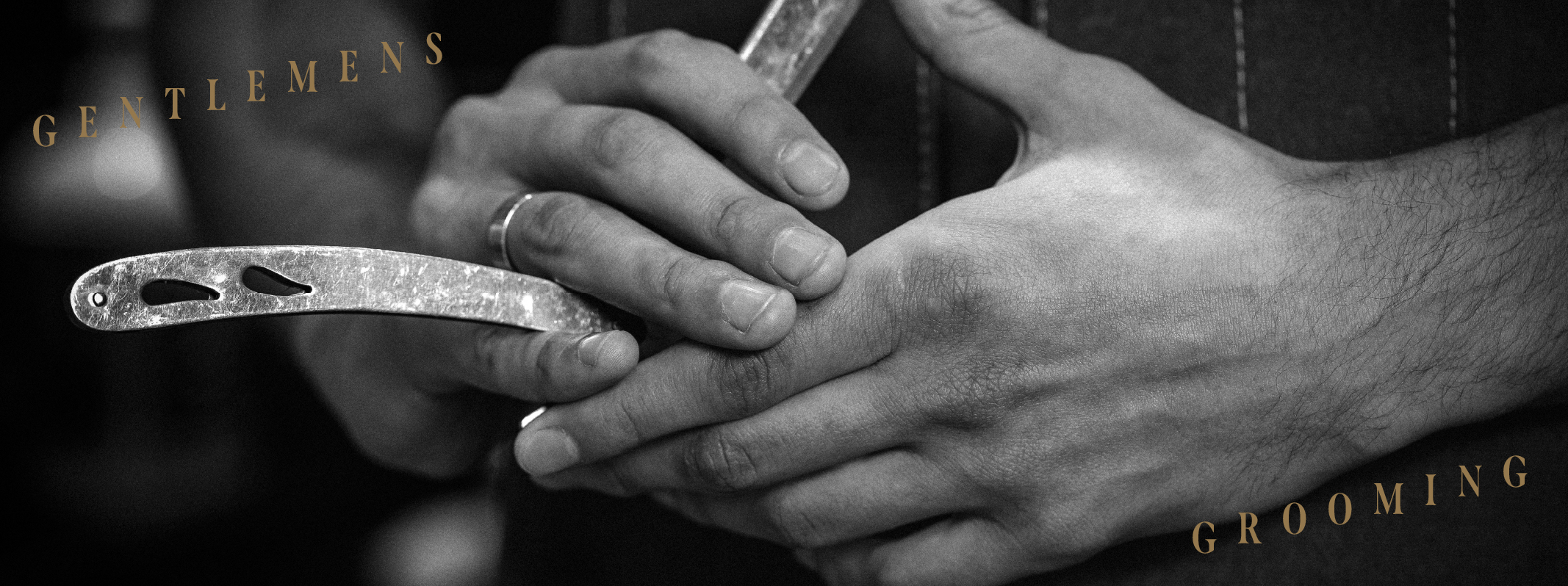
We drew inspiration from hand painted, vintage barber shop window displays, which are timeless, and re-imagined the typography, playing on the angles of the ‘barbers pole’ stripes. We crafted a palm tree icon which ties Clearcut to its home of Qatar, with its sharp lines inspired by the cut throat razor blade. The logo, typography, colors, and images come together to portray a sense of tradition, and trust you want to have in your barber.
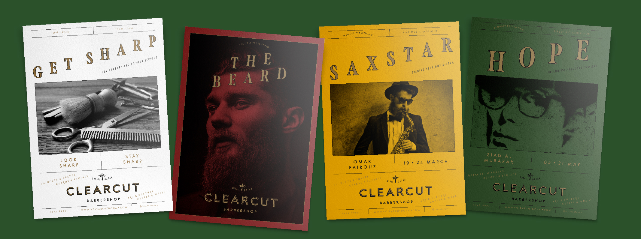
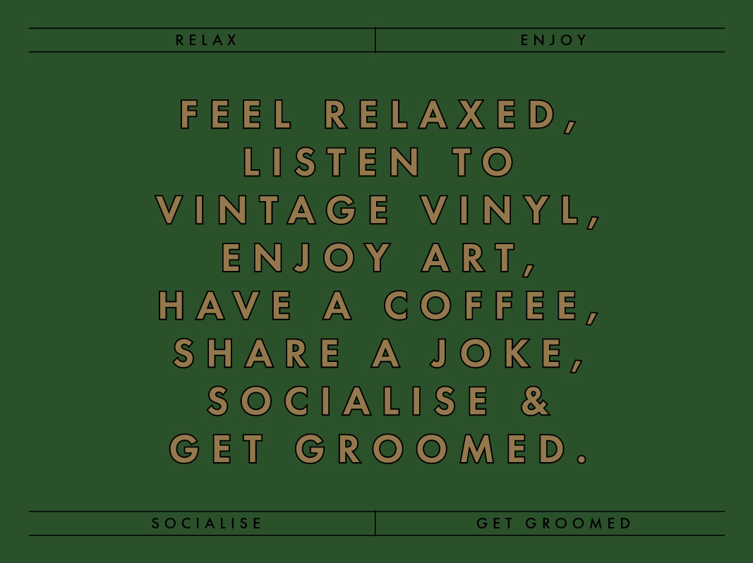
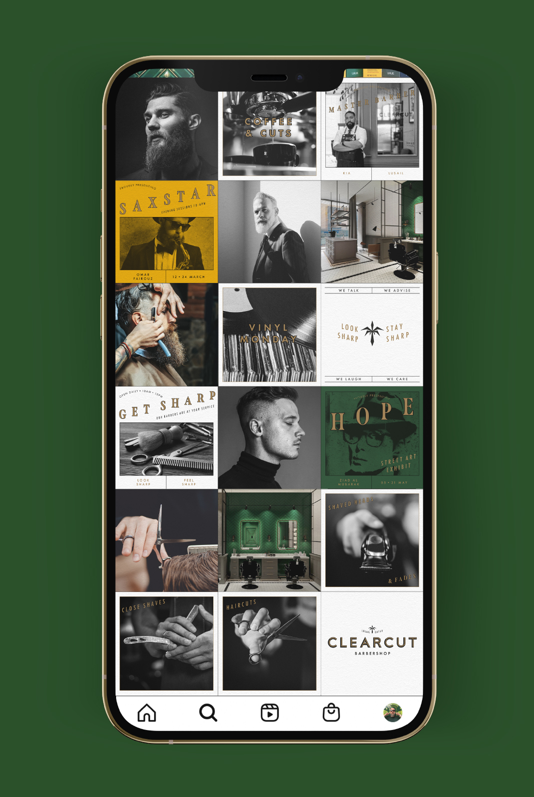
To enhance the community spirit and add personality, we suggested in store art and photography exhibitions, live music, and retro vinyls for the customer to choose from while getting groomed.
Clearcut stands out as the sharpest barber shop in Qatar.
To enhance the community spirit and add personality, we suggested in store art and photography exhibitions, live music, and retro vinyls for the customer to choose from while getting groomed.
Clearcut stands out as the sharpest barber shop in Qatar.
