Disciplines
Brand Identity / Brand Language
Industries
Qatar Ministry
Challenge
The Ministry of Social Development and Family approached The Creative Union in order to develop the right look and feel for their Min Al Witan initiative aimed at cultivating a market for home-grown products, made by Qataris, in Qatar. The big concept was set in motion in order to help preserve local traditions, highlight the importance of family-led enterprises and to encourage communities to engage in handicrafts.
Solution
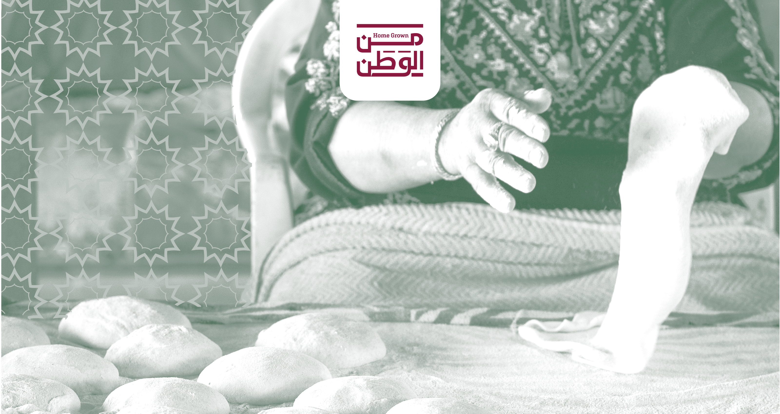
What transpired was a visual language that enhanced the significance of national patterns taken from architectural gems across the country, designs used in textiles, mosques, rugs, carpets and tiles.
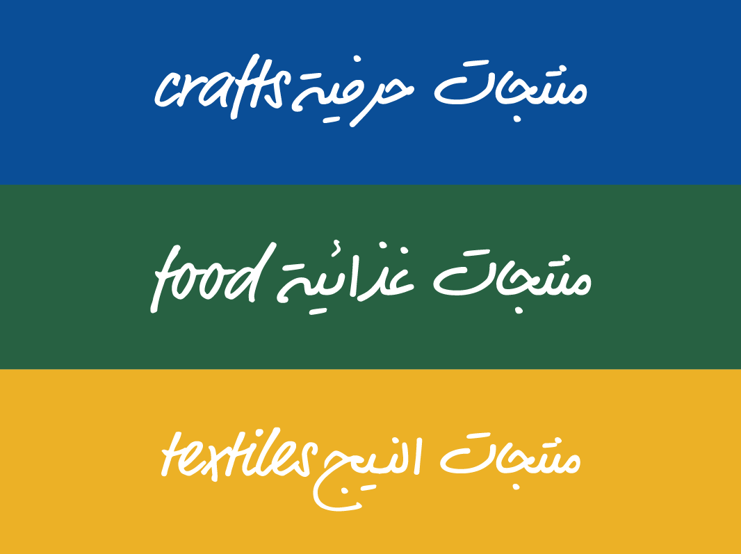
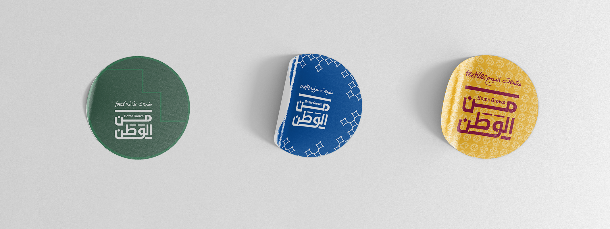
A colour code was developed especially for the differing categories of products, while the pattern variations represent the varying markets of Qatar. Blue represents arts and crafts products with patterns reflecting marine activities, while yellow is textile-oriented on a backdrop of local fabric-related shapes and outlines. Food products can be seen in green and are adorned in architectural symbolisms.
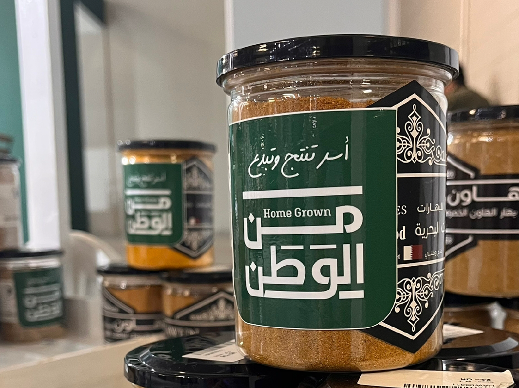
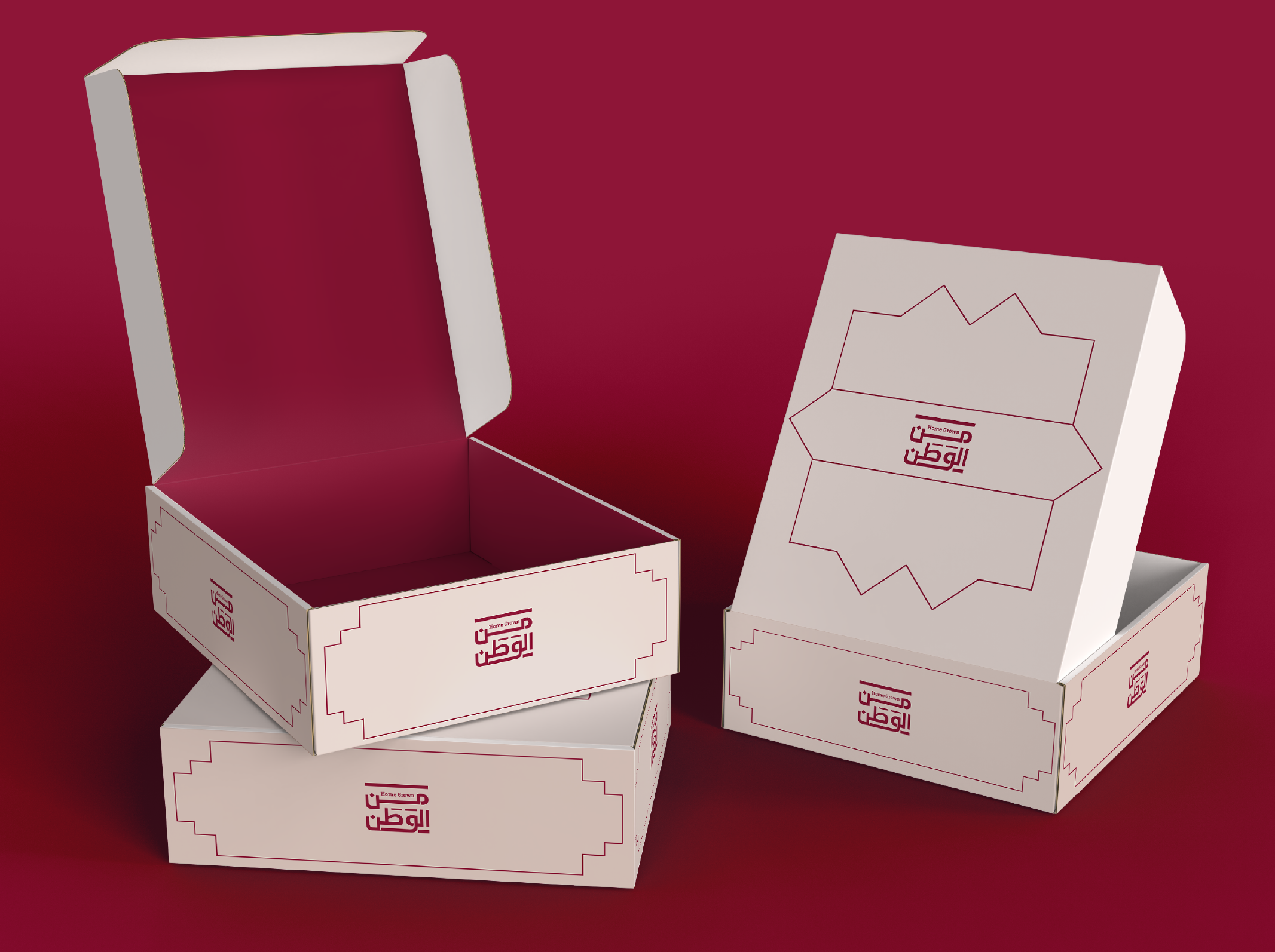
The logo comes in Qatar’s national colour of maroon and appears strong and bold, whilst also upholding the brand’s interchangeable slogans of “in the hands of Qatar” and “families create and thrive”.
A colour code was developed especially for the differing categories of products, while the pattern variations represent the varying markets of Qatar. Blue represents arts and crafts products with patterns reflecting marine activities, while yellow is textile-oriented on a backdrop of local fabric-related shapes and outlines. Food products can be seen in green and are adorned in architectural symbolisms.
The logo comes in Qatar’s national colour of maroon and appears strong and bold, whilst also upholding the brand’s interchangeable slogans of “in the hands of Qatar” and “families create and thrive”.